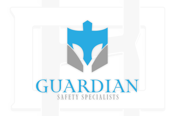
I was tasked to design a modern, protective emblem that conveys strength, security, and professionalism for Guardian Safety Specialists. The centerpiece of the logo should be a stylized Trojan helmet, abstracted into clean, geometric forms while incorporating some sort of shield-shaped badge.
Use a minimal color palette (such as bold blues and metallic grays) to suggest authority, clarity, and trust.
The badge should function both as a literal and metaphorical shield, reinforcing the company’s commitment to safety and reliability.
Typography should be sharp and confident, like a Trojan.
Program Used
Adobe Illustrator
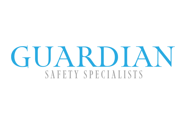
Map Roman Font
Map Roman reinforces the brand’s identity as a protector rooted in heritage, focused on safety, and built on trust. It’s sharp, dignified, and just bold enough—making it the perfect typeface to carry the Guardian name.