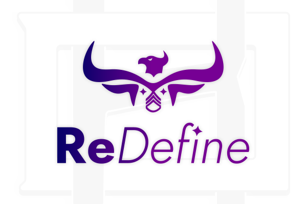
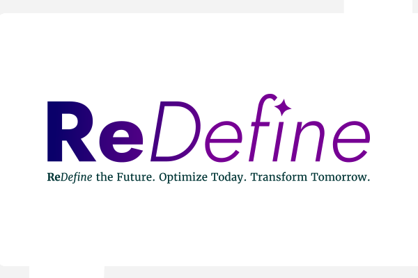
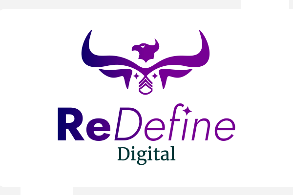
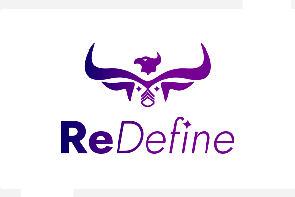
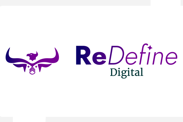
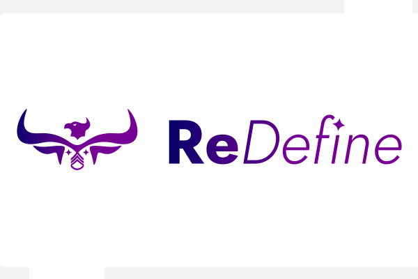
I was tasked with designing a bold, symbolic brand identity for ReDefine, a business rooted in transformation, resilience, and leadership. The logo merges a phoenix and a bull, drawing from Greek philosophy and the Taurus zodiac to represent rebirth, strength, and grounded determination. A Staff Sergeant military insignia is incorporated to honor the owner’s U.S. Army background, reinforcing values of leadership and discipline. The mark is paired with the ReDefine wordmark—where “Re” conveys strength and action, and “Define” with a sparkle over the “i” evokes clarity and transformation. The overall identity blends modern professionalism with mythological depth to reflect the brand’s purpose and story.
Program Used
Adobe Illustrator
Provided Logos
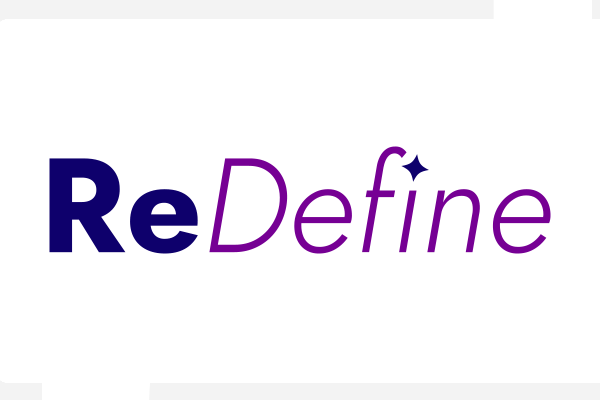
Gradient Logos
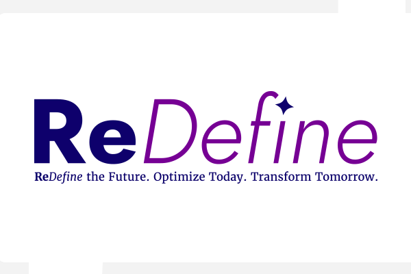
Two-Tone Wordmark
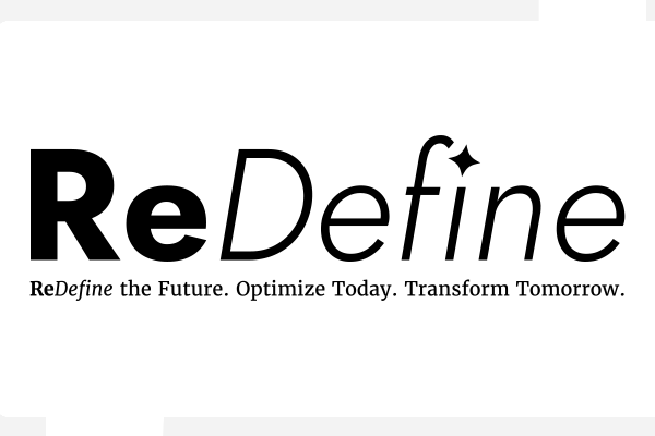
Black Logos
Fonts
Jost and Merriweather work well together because they offer a complementary balance of style and functionality, creating a clean and visually appealing typographic pairing. Jost, a geometric sans-serif inspired by Futura, has a modern, minimal look that feels fresh and contemporary, making it ideal for headlines and display text. In contrast, Merriweather is a classic serif font designed for readability on screens, with slightly condensed letterforms and a humanist touch that makes it perfect for body text. The contrast between Jost’s clean lines and Merriweather’s traditional serif structure creates visual interest and a clear hierarchy without clashing. Both fonts are open source and optimized for web use, with extensive weights and styles that allow for versatile typographic systems.
Color Palette
Statement Purple
Hex: #0e006c R14 G0 B108 C100 M100 Y19 K27
Purple Reign
Hex: #760094 R118 G0 B148 C68 M100 Y2 K0
Inspire Gradient
Statement Purple smooth linear gradient to Purple Reign